Expandable Tile
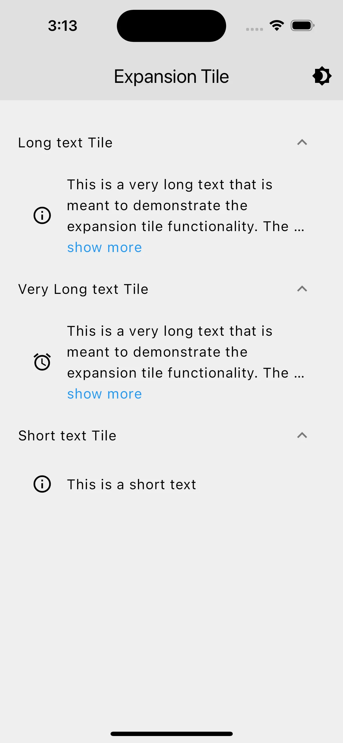
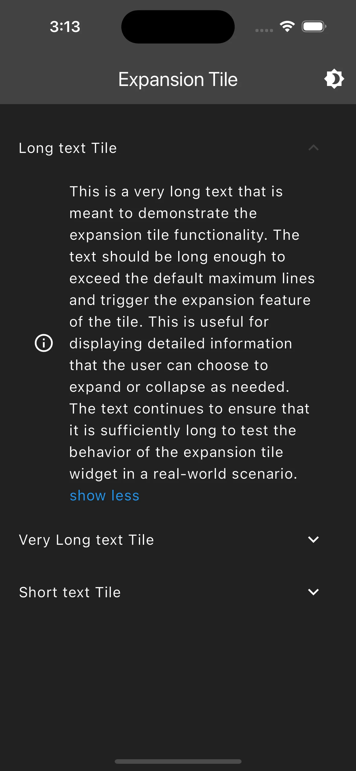
The ExpandableTextTile widget displays a tile that can expand and collapse to show or hide additional text. It includes a title, an optional icon, and a toggle to show more or less text.
Display
Features
- Expandable and Collapsible Text: The widget allows users to expand and collapse the text by clicking “show more” or “show less”. It is styled with a blue color to indicate that it is clickable.
- Customizable Icon: An optional icon can be displayed next to the text.
- Automatic Text Overflow Handling: The widget automatically handles text overflow and displays an ellipsis if the text exceeds the maximum lines when collapsed. This is achieved using
StatefulBuilder - Tile Padding: The tile padding is set to
EdgeInsets.only(left: 0, right: 15)by default. - Control Affinity: The control affinity is set to
ListTileControlAffinity.trailingby default. - Initial Expansion State: The tile is initially collapsed (
initiallyExpanded: false).
Usage
Import ExpandableTextTile in any page to display a tile with expandable text. It takes the following parameters:
title: A string representing the title of the tile.text: A string representing the text to display within the tile.icon: (Optional) AnIconDatato display an icon next to the text. The default icon isIcons.info_outline.
class ExpansionTileDemoPage extends StatelessWidget {  const ExpansionTileDemoPage({super.key});
  @override  Widget build(BuildContext context) {    return Scaffold(      appBar: AppBar(        title: const Text('Expansion Tile'),        actions: <Widget>[          IconButton(            icon: const Icon(Icons.brightness_4),            onPressed: () {              context.read<ThemeProvider>().toggleTheme();            },          ),        ],      ),      body: const Padding(        padding: EdgeInsets.all(20.0),        child: SingleChildScrollView(          child: Column(              mainAxisAlignment: MainAxisAlignment.spaceEvenly,              children: [                ExpandableTextTile(                  title: 'Long text Tile',                  text: 'This is a very long text that is meant to demonstrate the expansion tile functionality. '                      'The text should be long enough to exceed the default maximum lines and trigger the expansion '                      'feature of the tile. This is useful for displaying detailed information that the user can '                      'choose to expand or collapse as needed. The text continues to ensure that it is sufficiently '                      'long to test the behavior of the expansion tile widget in a real-world scenario.'                ),                ExpandableTextTile(                  title: 'Very Long text Tile',                  text: 'This is a very long text that is meant to demonstrate the expansion tile functionality. '                        'The text should be long enough to exceed the default maximum lines and trigger the expansion '                        'feature of the tile. This is useful for displaying detailed information that the user can '                        'choose to expand or collapse as needed. The text continues to ensure that it is sufficiently '                        'long to test the behavior of the expansion tile widget in a real-world scenario.'                        'This is a very long text that is meant to demonstrate the expansion tile functionality. '                        'The text should be long enough to exceed the default maximum lines and trigger the expansion '                        'feature of the tile. This is useful for displaying detailed information that the user can '                        'choose to expand or collapse as needed. The text continues to ensure that it is sufficiently '                        'long to test the behavior of the expansion tile widget in a real-world scenario.',                icon: Icons.access_alarm,                ),                ExpandableTextTile(                  title: 'Short text Tile',                  text: 'This is a short text',                ),              ],            ),          ),        ),    );  }}