Product Rating
Import StarRating in any of the pages. It takes following parameters:
rating: A double value representing the rating.starSize: (Optional) A double value to set the size of the stars.numberOfRatings: (Optional) An integer value representing the number of ratings.
Display
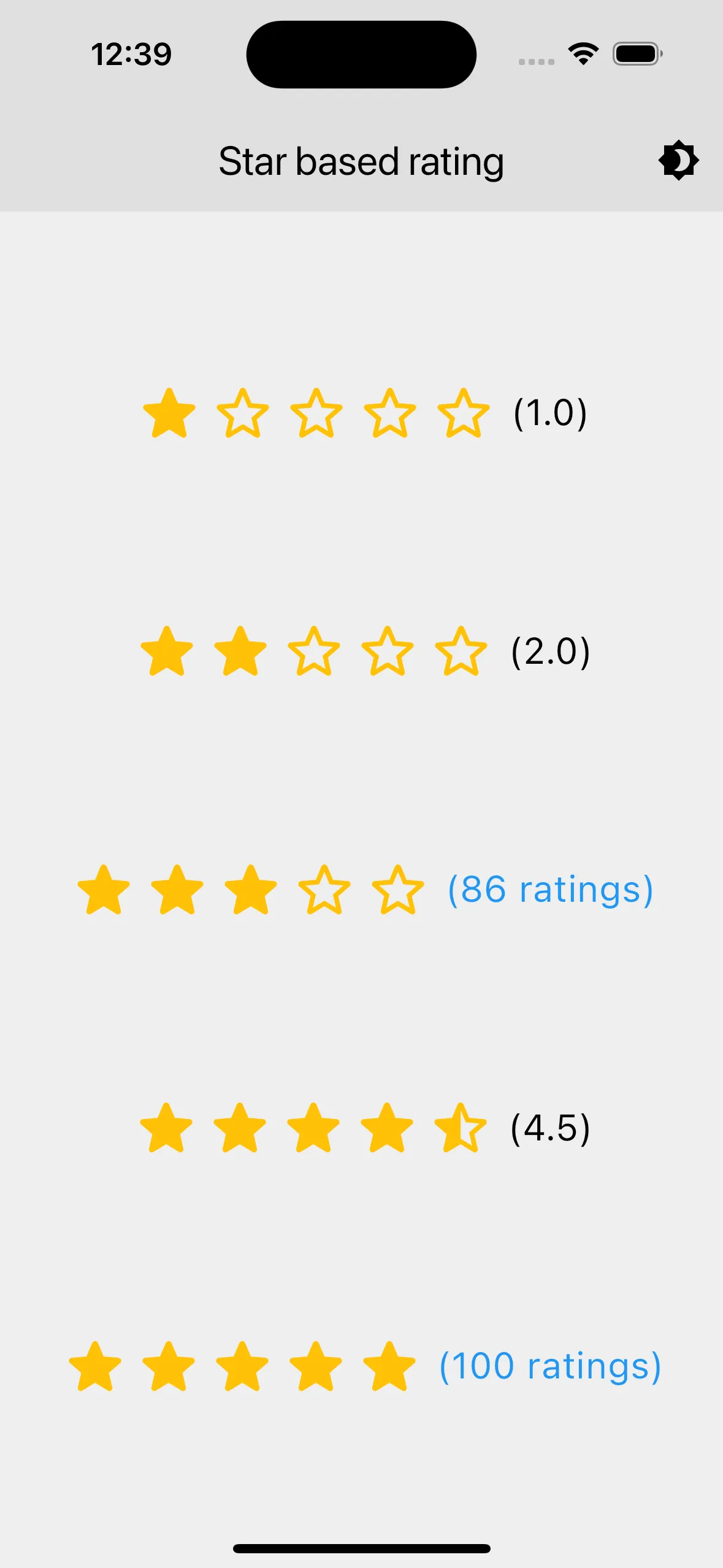
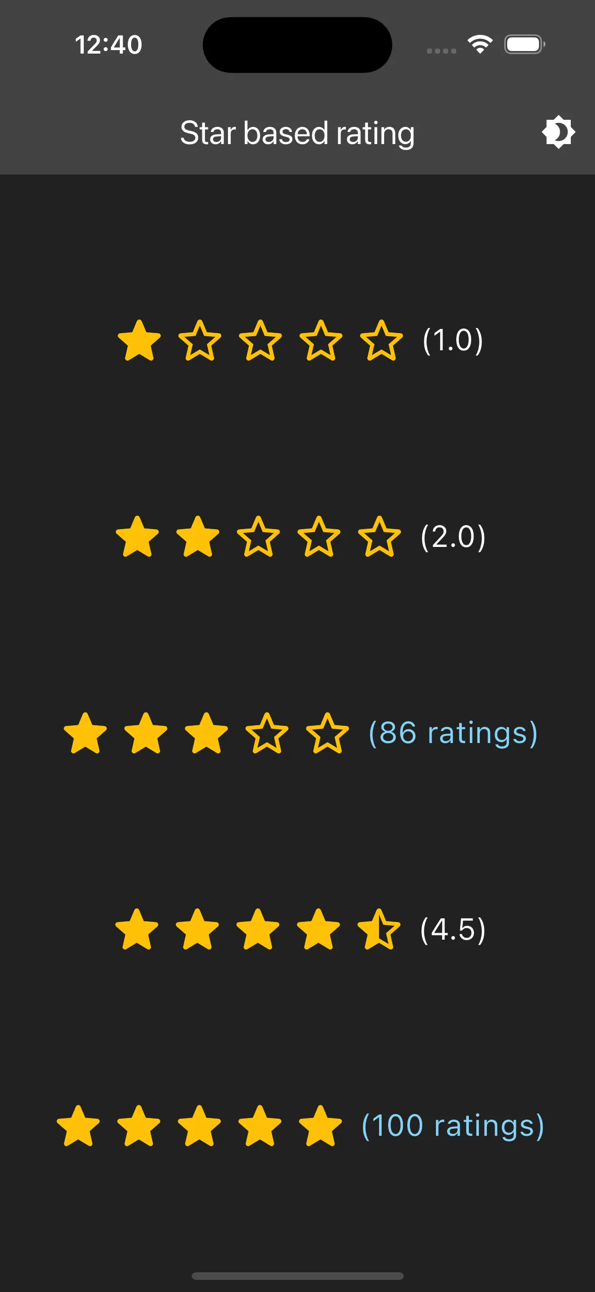
Features
- Full, Half, and Empty Stars: The widget displays full stars, half stars, and empty stars based on the provided rating.
- Optional Number of Ratings: If
numberOfRatingsis provided, it displays the number of ratings instead of the rating value. - Customizable Star Size: The size of the stars can be customized using the
starSizeparameter.
Customization
- Star Size: The
starSizeparameter allows you to set the size of the stars. - Rating Display: If
numberOfRatingsis provided, it displays the number of ratings. Otherwise, it displays the rating value formatted to one decimal place. - Theme Support: The text color for the number of ratings adapts to the current theme, using a light blue color in dark mode and blue in light mode.
Notes
- Ensure that the
ratingvalue is between 0 and 5 for accurate display. - The widget uses the
Providerpackage to access the current theme. Make sure to set up theThemeProvidercorrectly in your application.
Usage
import '../components/star_rating.dart';
class StarRatingDemo extends StatelessWidget {  const StarRatingDemo({super.key});  @override  Widget build(BuildContext context) {    return Scaffold(      body: Column(          mainAxisAlignment: MainAxisAlignment.spaceEvenly,          children: [            StarRating(rating: 1, starSize: 40),            StarRating(rating: 2, starSize: 40),            StarRating(rating: 3, starSize: 40, numberOfRatings: 86),            StarRating(rating: 4.5, starSize: 40),            StarRating(rating: 5, starSize: 40, numberOfRatings: 100),          ],        ),      ),    );  }}